Landing page design inspiration: what product teams ship vs what galleries pick
If you are designing a landing page for a software product, study what product teams ship themselves, not only award galleries. In 164 landing pages shared on X from August 27 to October 17, 2026, 38% of teams' own launches put the real product interface on the first screen, against 8% of picks from award galleries and tool vendors, which favour full-bleed photography, big type and scroll motion for agencies and cultural sites.
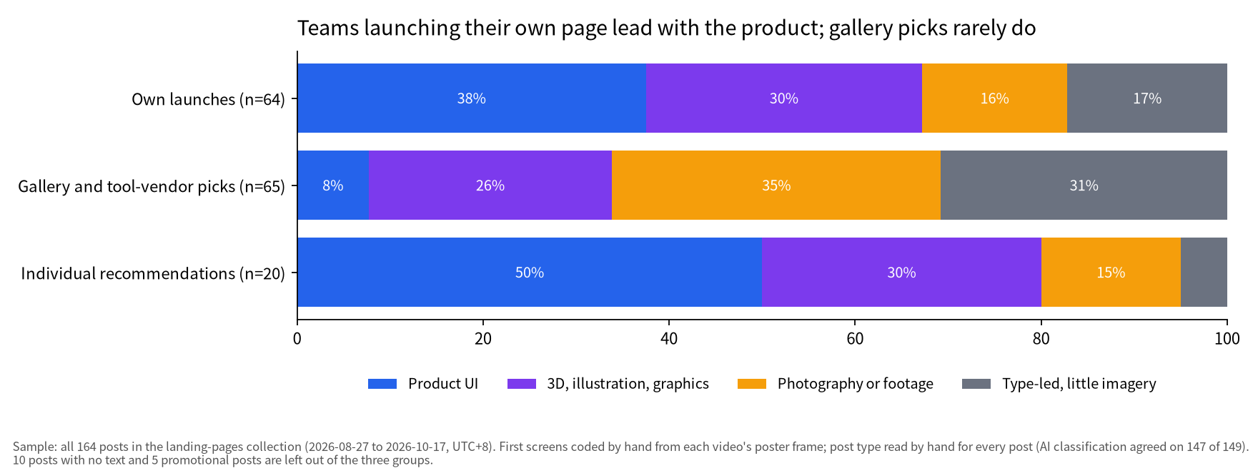
Galleries and product teams showcase different kinds of websites. Of 64 pages launched by product teams or the designers who built them, 24 (38%) lead with the actual product interface. Of 65 pages picked by galleries such as Awwwards or by tool vendors such as GSAP, only 5 (8%) do; the picks lean on photography (35%) and display type (31%), and most are studios, cultural venues or properties rather than software.
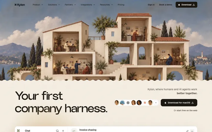
So for a product page, the most useful references are other products' own launches; galleries suit brand and showcase work. The most-saved posts were launches that explained how or why the page was built (Snew, 515 bookmarks; Interfere, 430) or a strong personal recommendation (kylon.io, 425). No gallery post passed 33.
This covers all 164 posts in the landing-pages collection, August 27 to October 17, 2026 (UTC+8), each with a screen recording of the page. Every first screen and post type was coded by hand, and bookmark counts were fetched on October 18. The 65 gallery and vendor posts are treated as curation, not as anyone's own claims; GSAP and Framer sell the tools used on the sites they feature. The counts describe what people share on X, not every landing page on the web.
For more real examples, browse the landing page inspiration collection; for personal sites, see personal website design examples and the personal sites collection; for launch films, the product launch videos collection.
Galleries and product teams show different kinds of sites
Gallery and vendor picks are mostly agencies, studios and cultural or property sites; teams' own launches are mostly AI and software. Of the 64 own launches, 36 are AI products and 17 software or SaaS; the 65 picks include 24 agencies or studios, 14 cultural, property or event sites and only 10 AI tools.
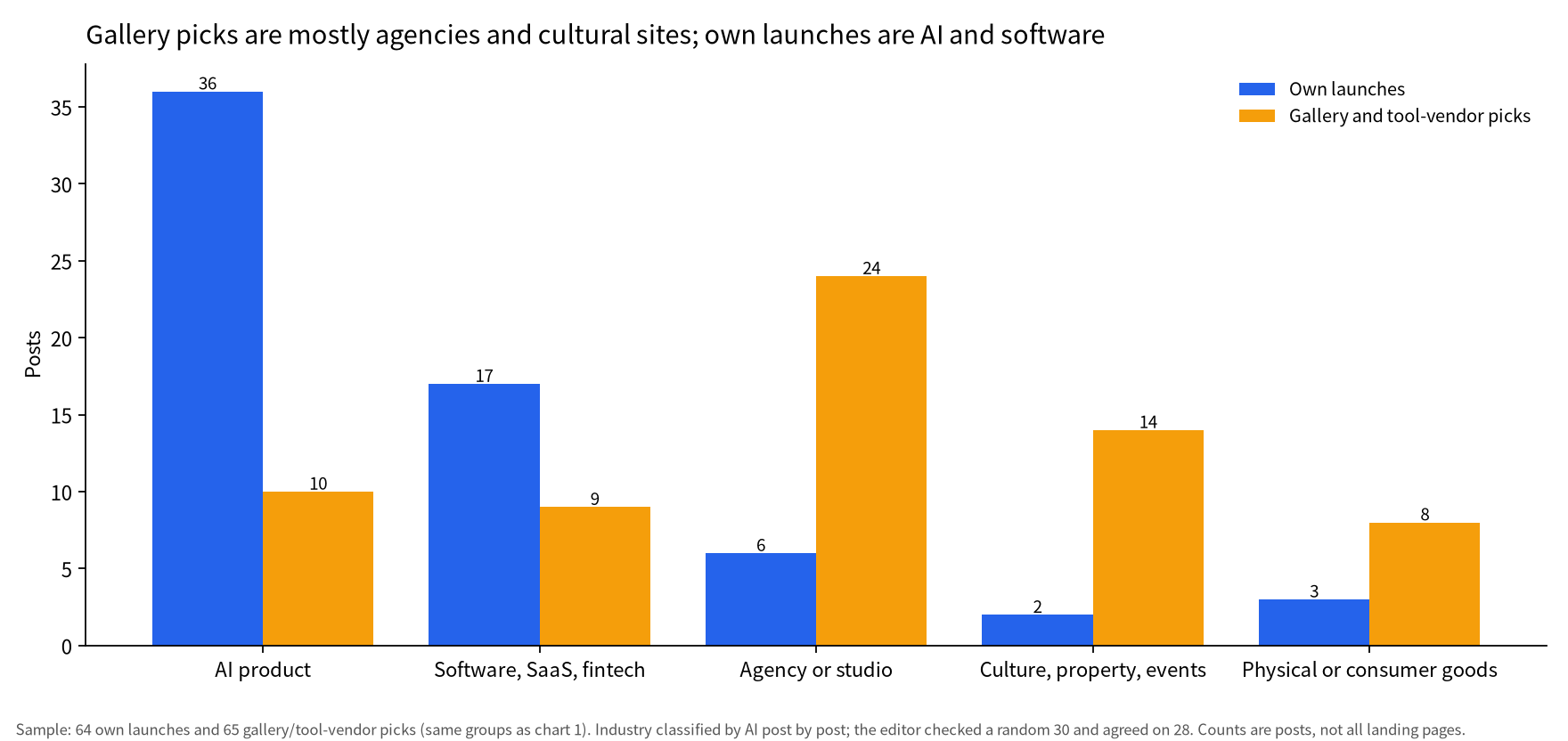
Sample/method: Sample: 64 own launches and 65 gallery/tool-vendor picks (same groups as chart 1). Industry classified by AI post by post; the editor checked a random 30 and agreed on 28. Counts are posts, not all landing pages.
Motion is what gallery posts call out: 29 of the 65 picks mention heavy scroll motion, WebGL or 3D, against 7 of the 64 own launches. GSAP (@greensock), the company behind the GSAP animation library, lists the GSAP plugins each featured site uses in its Site of the Day posts, so these posts double as a showcase of its own tool.
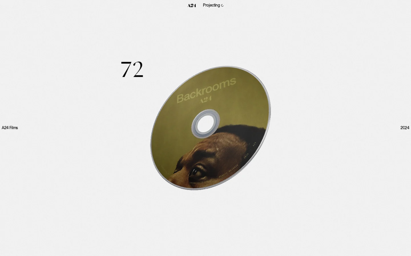
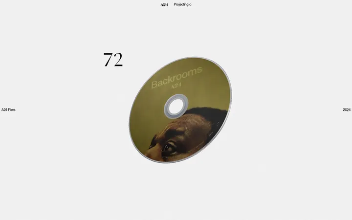
GSAP (@greensock) named Ravi Klaassens's A24 site its Site of the Week on September 23, 2026: a CD-themed scroll story on pale grey, with the GSAP plugins listed in the post. (Item: A24 Films: a CD-driven narrative site for the indie film catalog)
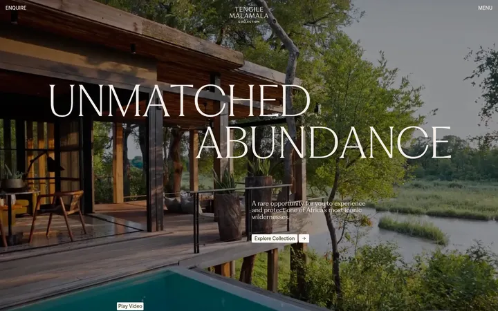
[Awwwards (@awwwards) gave its Site of the Day](https://www.awwwards.com/sites/tengile-malamala-collection) on October 3, 2026 to DashDigital and @ingamana for the Tengile MalaMala Collection: full-bleed lodge photography, serif display type, "cinematic storytelling". It is beautiful, but it sells a place, not a software product.
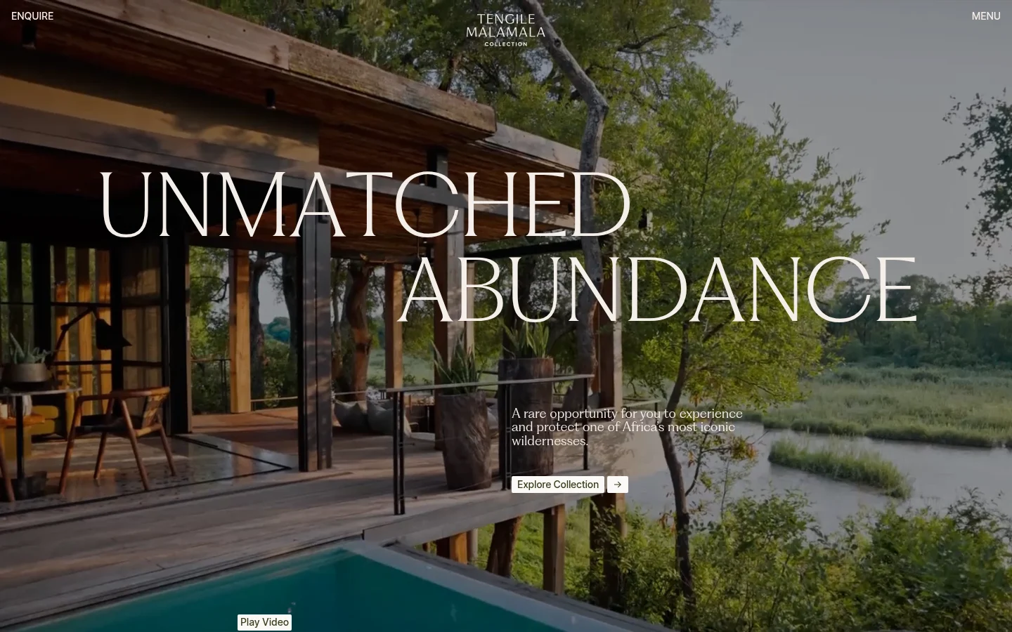
The Tengile MalaMala Collection, Awwwards Site of the Day: full-bleed photography and serif display type, a typical showcase site. (Item: Tengile MalaMala: quiet luxury in a whitespace-heavy serif site)
Table: Own launches vs gallery and tool-vendor picks
| Measure | Own launches (n=64) | Gallery and vendor picks (n=65) |
|---|---|---|
| Product UI on first screen | 24 (38%) | 5 (8%) |
| Photography leads | 10 (16%) | 23 (35%) |
| Type-led | 11 (17%) | 20 (31%) |
| Dark first screen | 26 (41%) | 28 (43%) |
| Serif headline | 13 (20%) | 11 (17%) |
| AI product | 36 (56%) | 10 (15%) |
| Text calls out heavy scroll motion, WebGL or 3D | 7 (11%) | 29 (45%) |
| Median bookmarks | 3 | 2 |
Sample/method: First screen, background and type coded by hand from each poster frame; industry and motion classified by AI from post text and page descriptions (random 30 checked: industry 28 agreed, motion 29). Motion reflects what posters mention, not a measurement of the pages. Bookmarks are public counts from 2026-10-18.
Light versus dark does not separate the two groups: 41% of own launches and 43% of picks open on a dark screen, close to the 38% across all 164.
What product teams put first: the product
The most common first screen in teams' own launches is a short headline above the real product interface, 24 of 64, and the builders explain why.
Sample/method: Sample: all 164 posts in the landing-pages collection (2026-08-27 to 2026-10-17, UTC+8). First screens coded by hand from each video's poster frame; post type read by hand for every post (AI classification agreed on 147 of 149). 10 posts with no text and 5 promotional posts are left out of the three groups.
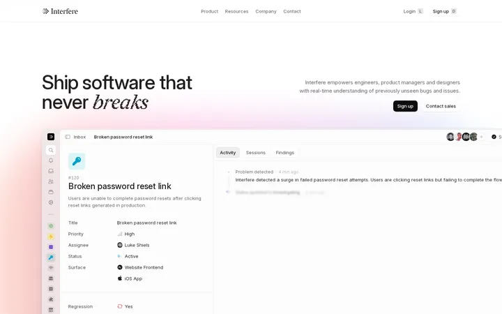
Interfere puts the headline "Ship software that never breaks" above the product's inbox with a sample bug ticket. In the team's write-up, Paul Faivret and Jakub Krehel say: "We are big fans of websites where the marketing page is the product," and "Most of the animations we built give you a glimpse into how the product works." They used skeleton UI for the unimportant parts so the product graphics stay uncluttered.
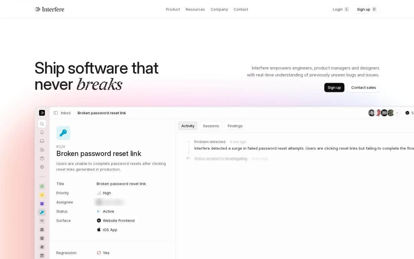
Jakub Krehel (@jakubkrehel) shared Interfere's build write-up on September 25, 2026; the first screen is a one-line headline above the product inbox. (Item: Interfere's new site pairs a pink-orange glow with a live inbox demo)
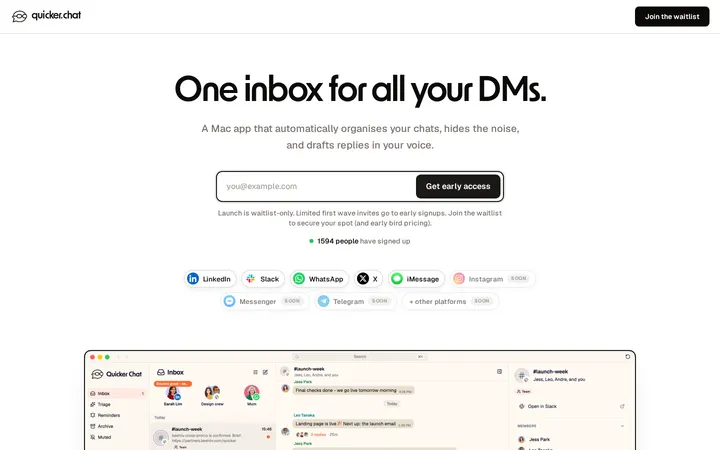
Tom Alder (@tomaldertweets) listed 8 things behind the quicker.chat page and says it got more than 1,200 signups in under 24 hours (self-reported). Among them: say what it is in six words ("One inbox for all your DMs."), "show the real product, not a mockup", a live signup counter, an email box already selected when the page loads, a letter from the founder instead of a feature grid, and an FAQ that answers the objection that closes the tab.
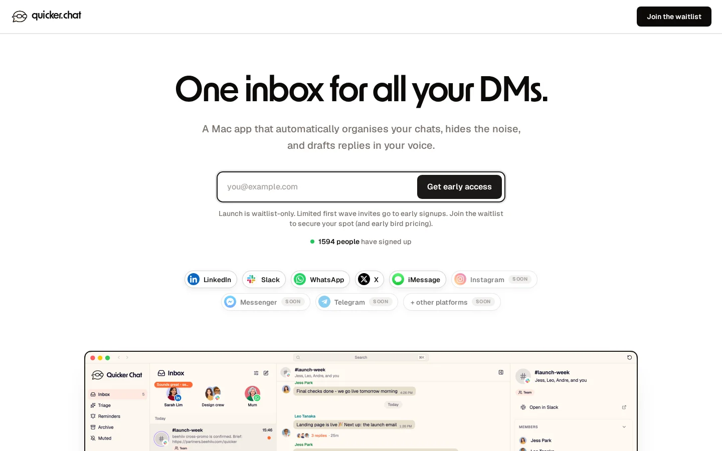
Tom Alder (@tomaldertweets) posted the quicker.chat page on September 29, 2026: a six-word headline, a pre-focused email box, a live signup counter and a real app screenshot. (Item: Quicker: an all-platform Mac inbox on a cream background)
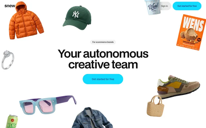
When the output is visual, the product can be shown directly. Snew scatters product shots around one headline and snaps them into a grid as you scroll; JP (@joaopaulots) says the update was built "using Codex only" (self-report).
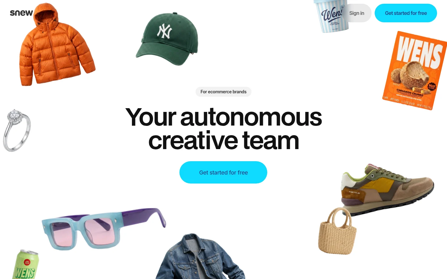
JP (@joaopaulots) shared Snew's updated page on October 7, 2026: product shots scattered around the headline, which assemble into a grid on scroll. (Item: Snew: an autonomous AI creative team for e-commerce brands)
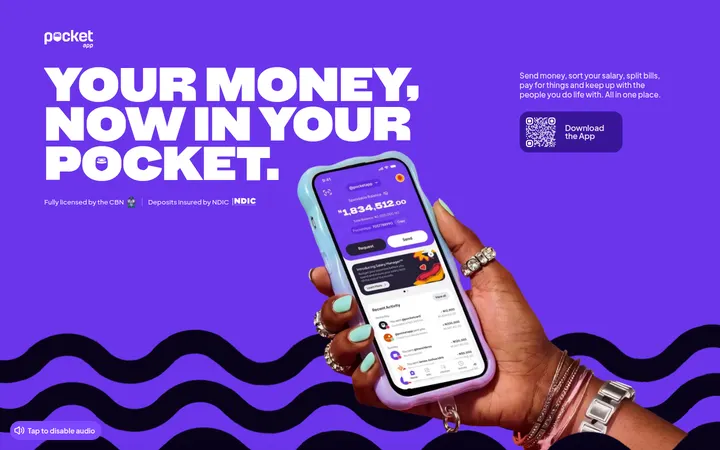
Pocket takes the same idea to a mobile app: big type on purple, a hand holding the app and a download QR code. ajanwachuku. (@ajanwachuku) designed and built the page; the post drew 225 bookmarks.
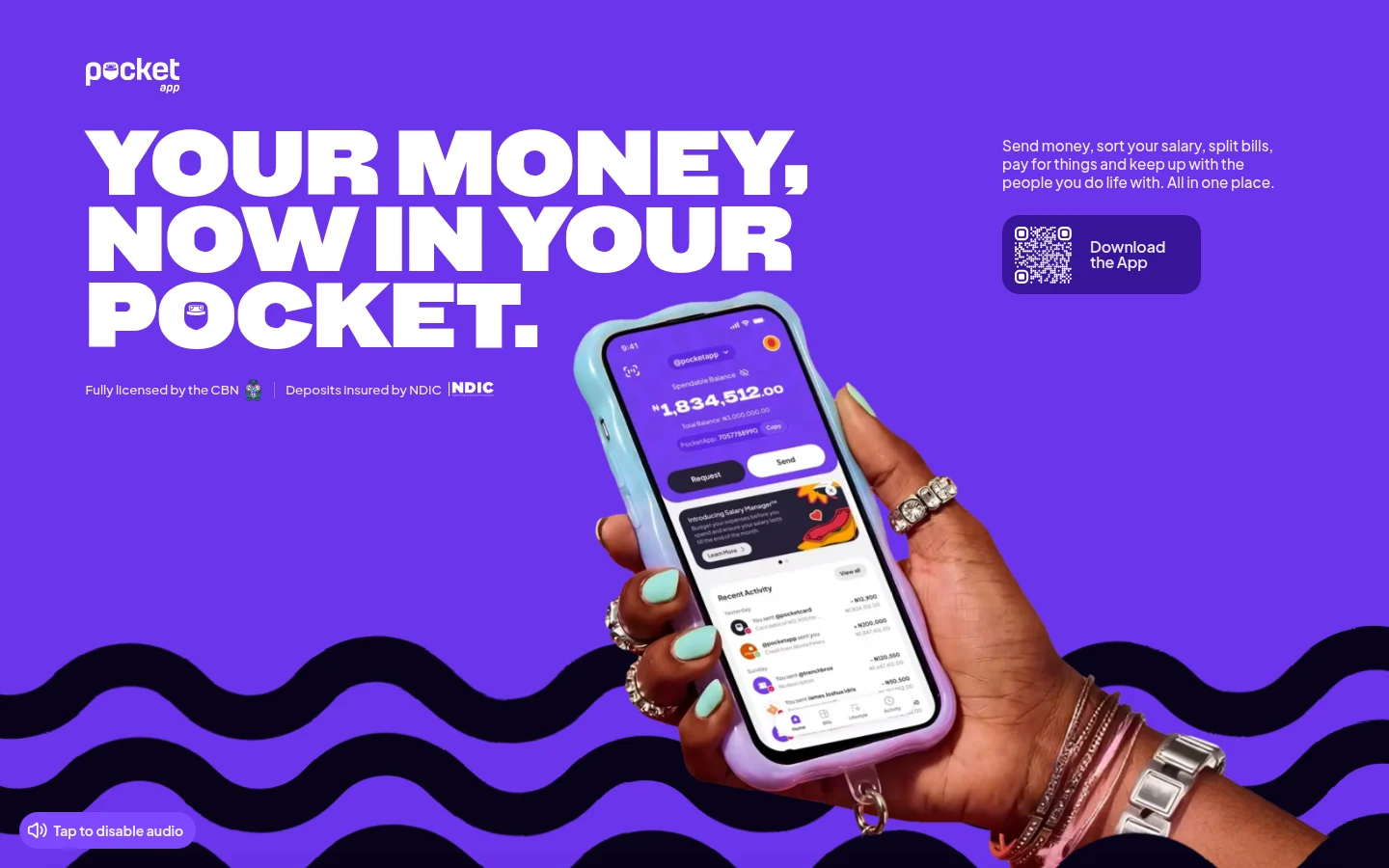
ajanwachuku. (@ajanwachuku) shared Pocket's new page on October 16, 2026: bold type on purple, the app in hand and a QR code. (Item: Pocket's new landing page pairs bold purple type with phone photography)
Let visitors try it, or hide an easter egg
The pages individuals praised most often let visitors use the product or watch it work instead of reading about it. These are examples, not a count.
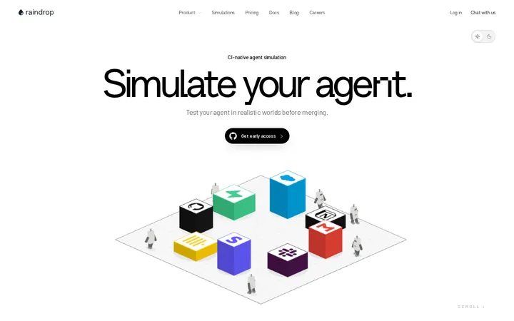
Raindrop Simulate is the playful version: "you can throw the robots around on our new landing page," ben hylak (@benhylak) posted.
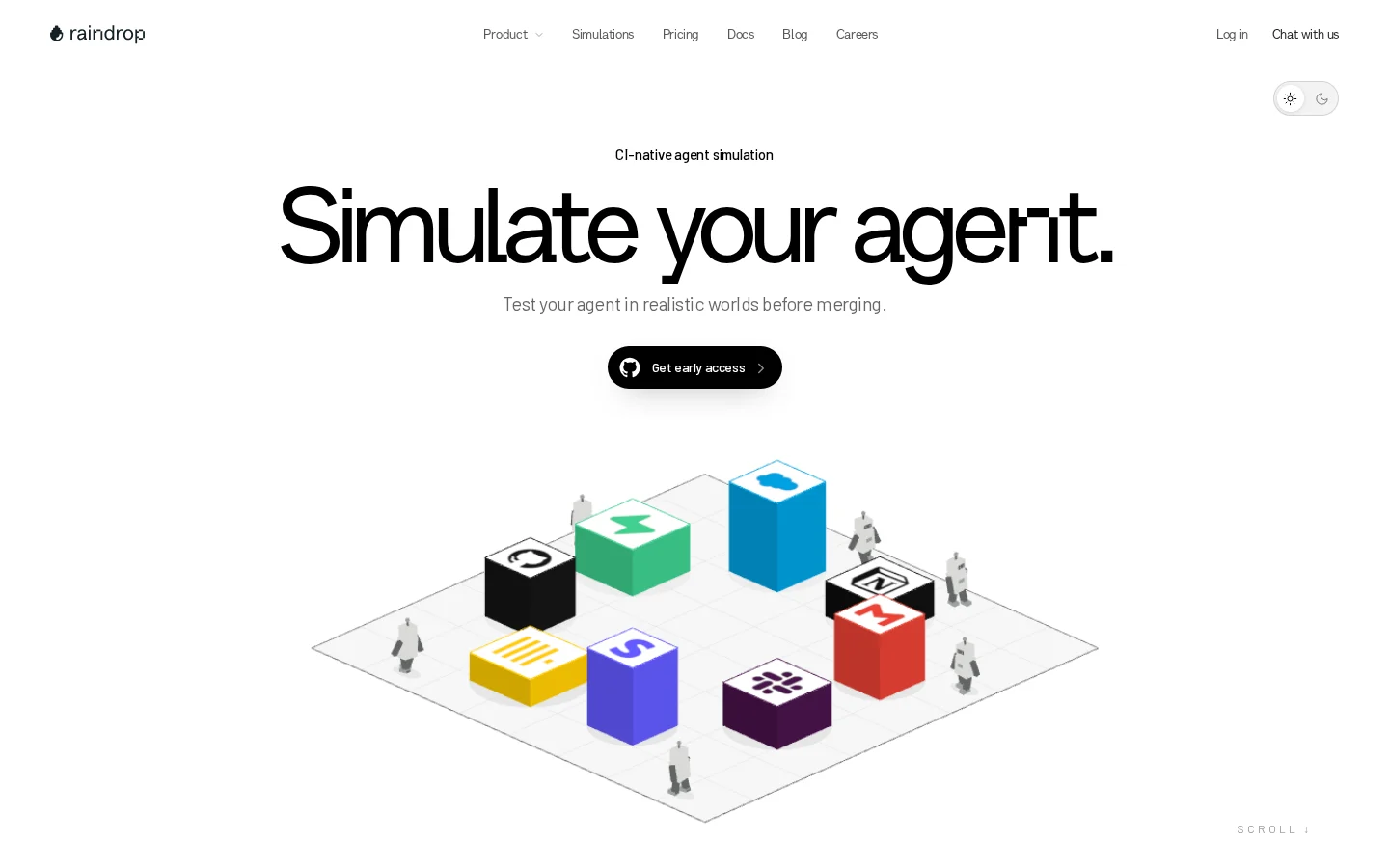
ben hylak (@benhylak) shared Raindrop Simulate on September 18, 2026: an isometric scene with robots you can drag. (Item: Raindrop Simulate: an interactive landing page for agent simulation)
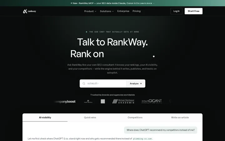
Karsen (@karsenswins) picked RankWay as a runner-up because "the website actually lets you experience the product instead of just explaining it": you enter your own site on the homepage. The criticism: "the page is LONG". Karsen's top pick that week, Apptonic, "visually shows you exactly what the product does" as you scroll; the takeaway was "Dont just explain the customer experience. Show it."
Vidform does it with a single input box in the middle of the first screen and real output thumbnails below.
An easter egg is a cheap, memorable detail. BoardRepo offered merch to the first person to find the one on its page; Jim Raptis (@d__raptis) shared the one on marclou's mailcheap.ai; Interfere hides a link to its careers page behind the plus in the hero's list of active users.
Which landing page posts got saved most
Bookmarks went to launches with a story and to strong personal recommendations, not to gallery posts. The top 10 are 6 own launches, 3 recommendations and 1 promotion, with no gallery post, and they hold 77% of the 3,533 bookmarks. The median post has 2.
Table: The 10 most-bookmarked landing page posts
| Rank | Posted by | Site | Type | First screen | Bookmarks | Likes |
|---|---|---|---|---|---|---|
| 1 | JP (@joaopaulots) | snew.ai | Own launch | Photography | 515 | 610 |
| 2 | Jakub Krehel (@jakubkrehel) | interfere.com | Own launch | Product UI | 430 | 321 |
| 3 | Jonathan Wilke (@jonathan_wilke) | kylon.io (recommended) | Recommendation | 3D/illustration | 425 | 313 |
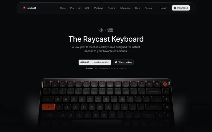
| 4 | Pedro Duarte (@peduarte) | raycast.com/keyboard (recommended) | Recommendation | 3D/illustration | 397 | 890 |
| 5 | Sawyer Merritt (@SawyerMerritt) | spacex.com/Mid-South (news post) | Recommendation | Photography | 275 | 2,990 |
| 6 | ajanwachuku (@ajanwachuku) | pocketapp.com | Own launch | Product UI | 225 | 859 |
| 7 | Czlavko (@Czlavko) | vidform.ai | Own launch | Product UI | 136 | 76 |
| 8 | Alok (@Alok619308) | cuedesign.space | Promotion | Type-led | 116 | 90 |
| 9 | Framer (@framer) | framer.com/skills (builder vendor's own feature) | Own launch | Product UI | 100 | 215 |
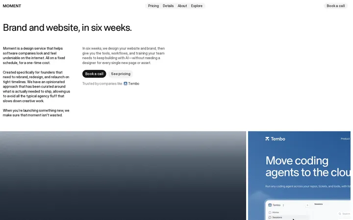
| 10 | Riley Hennigh (@rileycx) | moment.so | Own launch | Type-led | 84 | 84 |
Sample/method: Bookmarks and likes are public counts fetched 2026-10-18 (162 of 164 posts had data); type and first screen coded by hand. The top 10 hold 77% of all 3,533 bookmarks; none is a gallery post.
Explaining the build seems to help. Interfere's post was only a link to the write-up and drew 430 bookmarks. Riley Hennigh (@rileycx) explained Moment's homepage: the carousel shows real client work, sometimes as actual interactive code, and "it takes more time and effort to keep it simple."
Reach matters too. Sawyer Merritt's post about SpaceX's Mid-South site had about 523,000 views and is mostly news, not design. Pedro Duarte's post on the Raycast keyboard credited @thomasauros for the page.
The best-saved gallery or vendor post had 33 bookmarks. Median bookmarks per account: Awwwards 19, GSAP 11.5, CuratedDesignHQ 10, One Page Love 2, CSS Winner 0.5, Orpetron 0. Galleries are useful catalogues, but on X their posts are rarely saved.
Colour, type and AI-built pages: no single answer
No colour or typeface rule shows up. 62% of all 164 first screens are light, and serif headlines appear on 17% (28 pages), at similar rates in both groups.
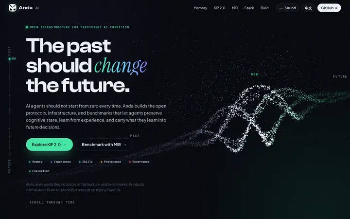
AI is now part of how pages get built: 3 own-launch posts say an AI model built or redesigned the page. Besides Snew with Codex, Nic Mauro (@Nicmauro) wrote that Virlo's whole site was redesigned with Claude Opus 5.5 and non-essential calls to action removed, and ICPanda (@ICPandaDAO) posted the Claude Code prompts behind anda.ai, a WebGL field of up to about 15,000 particles across 23 scroll-driven scenes. All self-reports.
Builders warn about sameness. Tom Alder: "AI is making every landing page FEEL the same. the human ones are what stand out now." Interfere's team: "Over-animation is a real thing, especially now that it's very easy to animate anything."
How to use these references
Editor's advice drawn from the data and cases above, not a tested recipe.
-
Pick references by goal. For a software product, study other products' own launches; use galleries for brand, studio and campaign sites.
-
Decide what the first screen shows: the product working (Interfere, quicker.chat), the product itself (Snew, Pocket) or something visitors can try (Raindrop Simulate, RankWay).
-
Say what it is in a few words, as in "One inbox for all your DMs."
-
Use motion to explain the product and keep it limited. Interfere plays its heavy hero animation only on the first visit.
-
Add one human detail: a note from the founder, an easter egg, or a write-up of how you built it.
Questions and answers
What's the best landing page of the year?
There is no agreed answer. Vibrant Design (@vibrantdesign_) asked the question on October 10, 2026, calling ToDesktop's page "the best landing page on the internet" and asking for one that beats it. In this collection the most-saved were Snew (515 bookmarks), Interfere (430) and kylon.io (425, recommended by Jonathan Wilke); Karsen chose Apptonic as the favourite of one week.