GPT Image 2.5 takes on a dense English typography poster
A Swiss International Style architecture exhibition poster tests multiple font sizes, bold display numbers and two-column body copy, and the author says the typographic grid and kerning held without spelling errors.

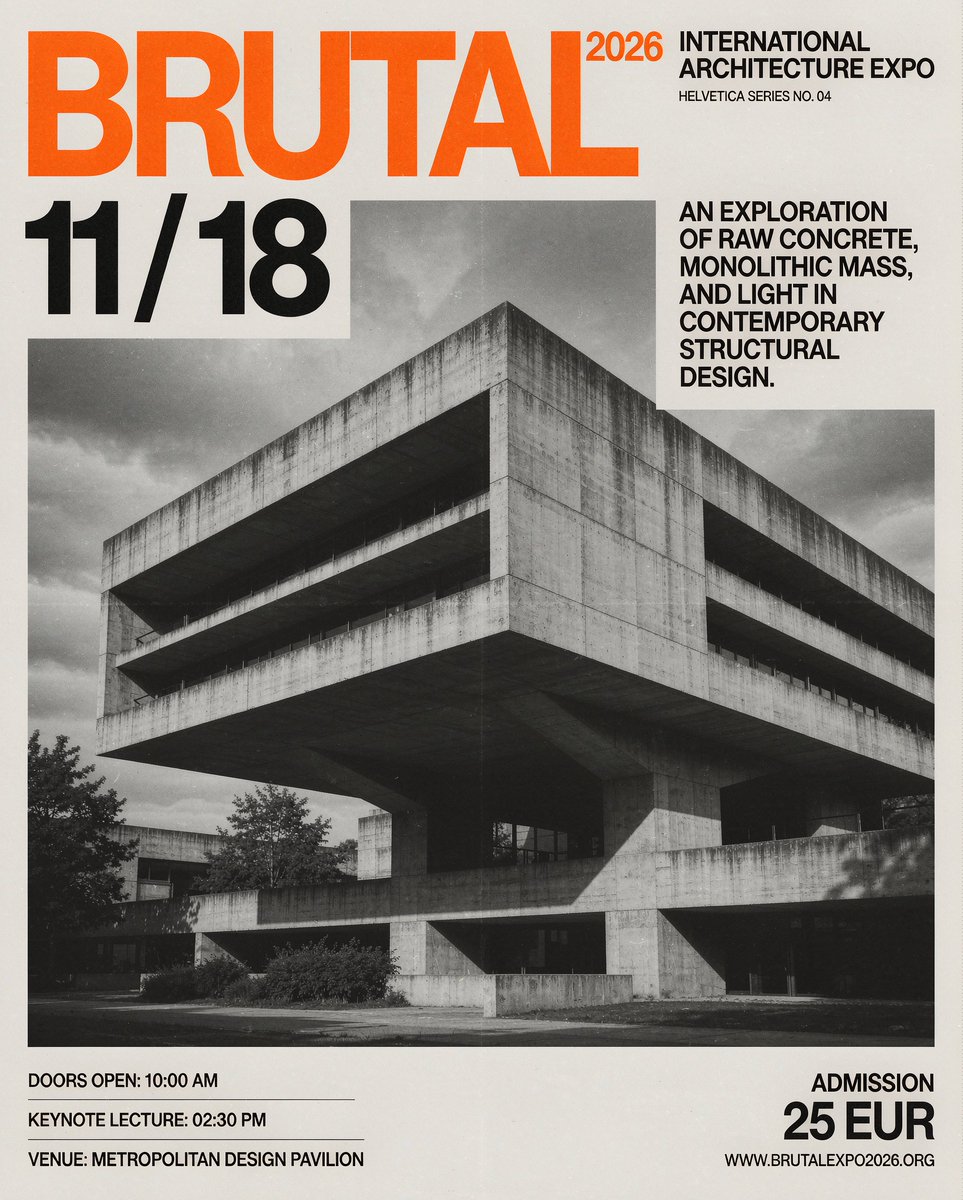
6/7 Dense English typography has historically been a weak point for diffusion models. I pushed it with an architectural poster requiring multiple font sizes, bold display numbers, and multi-column body copy. It held the entire typographic grid and kerning together without spelling errors or distorted letterforms. Prompt: A vertical 4:5 modern Swiss international style graphic design poster for an architectural exhibition. The background features a striking black-and-white architectural photograph of a brutalist concrete cantilever building with sharp geometric shadows and soft overcast sky. Typography & Text Layout: Top Left (Ultra-bold sans-serif title in electric orange): "BRUTAL / 2026" Top Right (Clean black typography): "INTERNATIONAL ARCHITECTURE EXPO" "HELVETICA SERIES NO. 04" Middle Left (Oversized bold display numbers): "11 / 18" Middle Right (Two-column exhibition description in clean, tight sans-serif): "AN EXPLORATION OF RAW CONCRETE, MONOLITHIC MASS, AND LIGHT IN CONTEMPORARY STRUCTURAL DESIGN." Bottom Left (Event itinerary): "DOORS OPEN: 10:00 AM" "KEYNOTE LECTURE: 02:30 PM" "VENUE: METROPOLITAN DESIGN PAVILION" Bottom Right (Ticketing details): "ADMISSION: 25 EUR" "WWW[.]BRUTALEXPO2026[.]ORG" Aesthetic & Finish: Asymmetrical grid layout, matte heavy paper texture, pure clean typographic hierarchy, high-contrast monochrome with orange accents, with all English text rendered tack-sharp without distortion.