User reviews GPT-6 Astra's taste and UI sense
A user says Astra has better taste than earlier models but still fills output with pointless text, its color palette gets old fast, and building UI with it needs a lot of hand-holding.

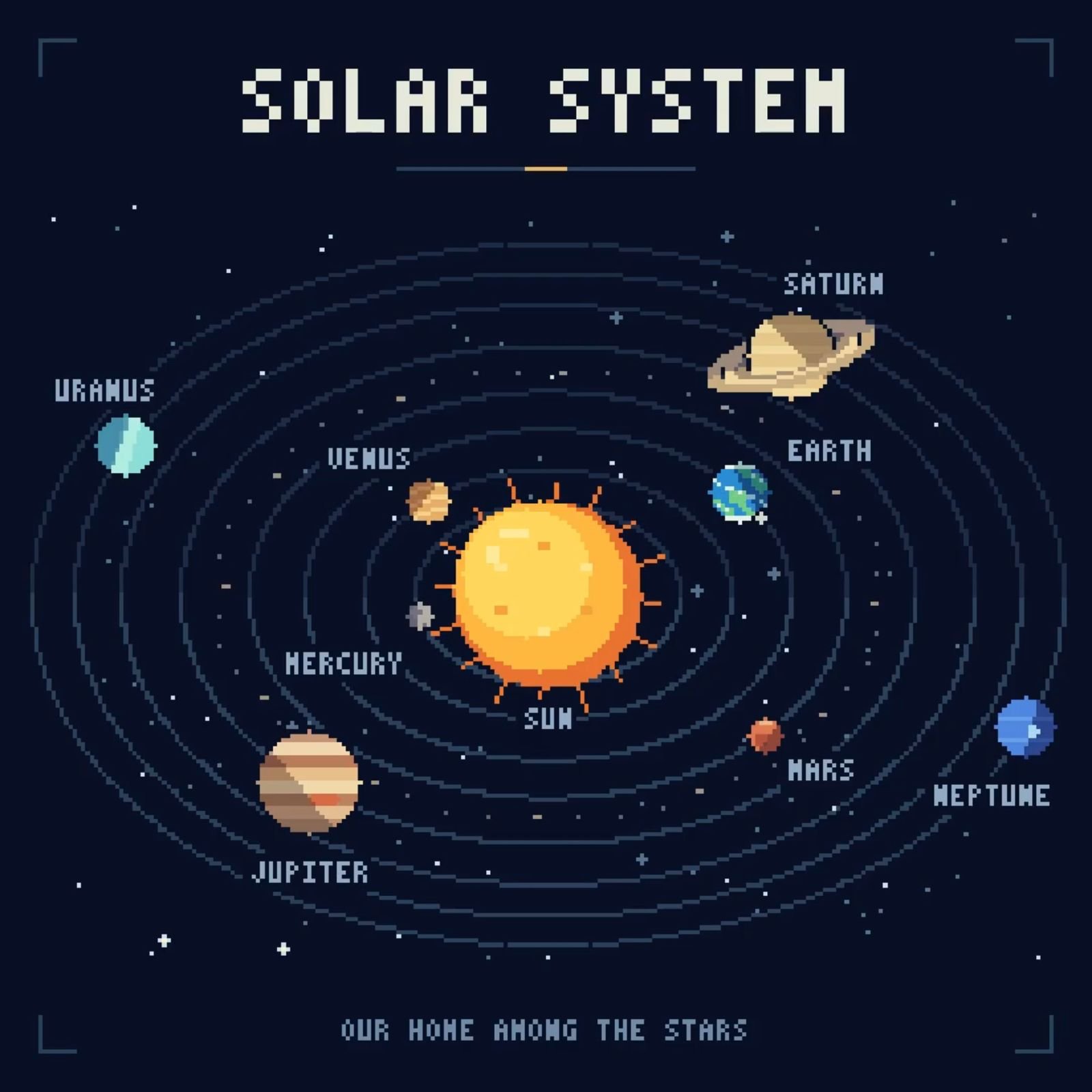
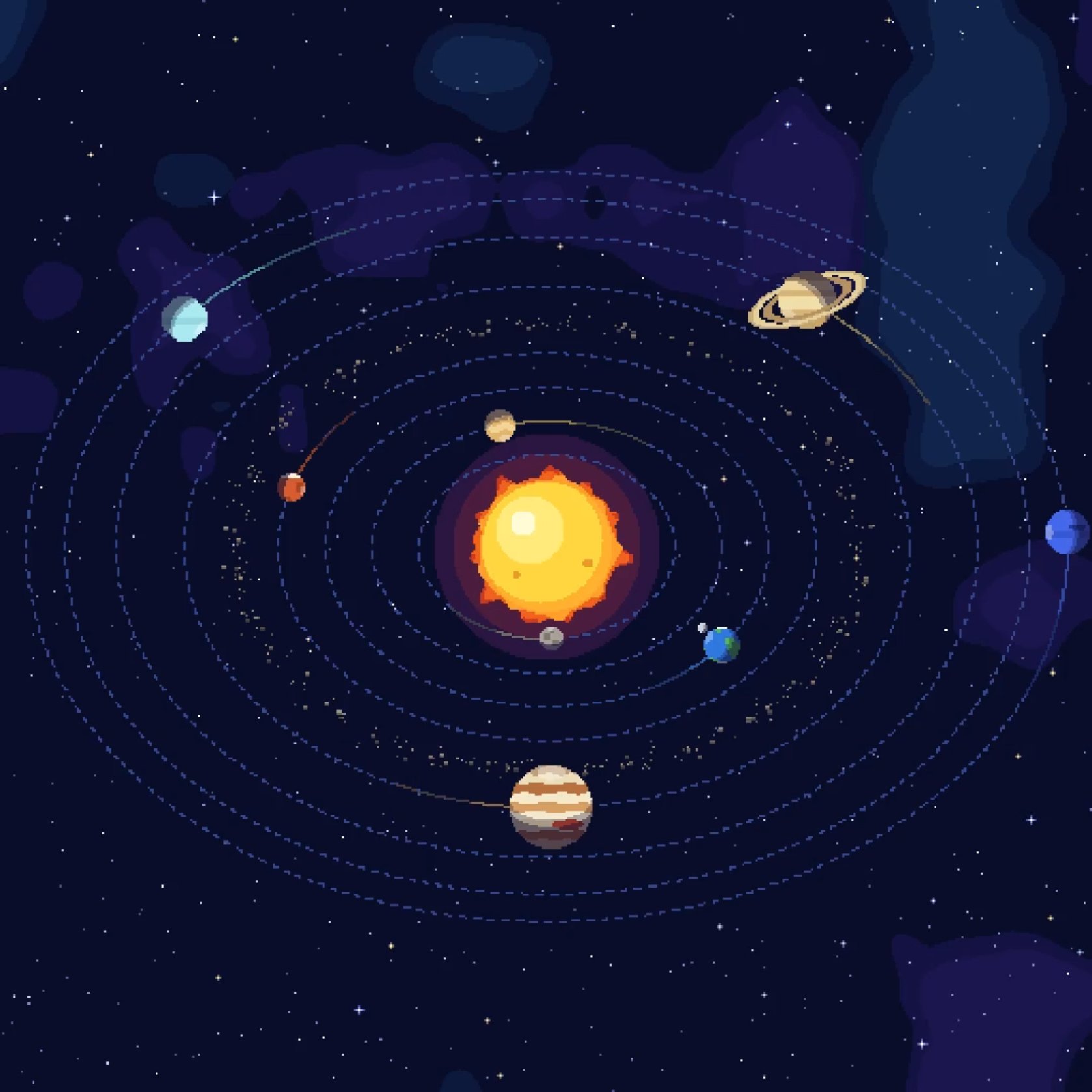
Yeah I get it, I just want to make it clear that I mean this as feedback, not criticism GPT-5 was the first time we saw some taste from OpenAI's models, but all the models have some very persistent habits GPT-5 always used that dark blue gradient background, text was constantly overflowing, etc. The models that followed kept having those issues, except GPT-5.6, which did change things but still wasn't a huge leap GPT-6 Astra has better taste too, but it still doesn't reach the level of other models. It fills everything with way too much unnecessary text (I asked it for pixel art of the solar system and it added phrases that just took up space, Opus 5.5 for comparison), and those muddy greenish tones felt like a breath of fresh air at first but are already getting old. I'd say it can make really cool things but needs a lot of hand-holding, and it's very reluctant to step outside its comfort zone when it comes to UI The personality has improved too, but again, it's still not enough. Anthropic's models still feel like they have much more character and creativity overall, I know it's very subjective I do think we're seeing progress but all the hype made me expect a model as big as Astra to finally match Fable or similar models in this area And thank you so much for taking the time to read all this and ask questions