aiVIDEO
Wron: a dark 3D landing page for chat-to-app building
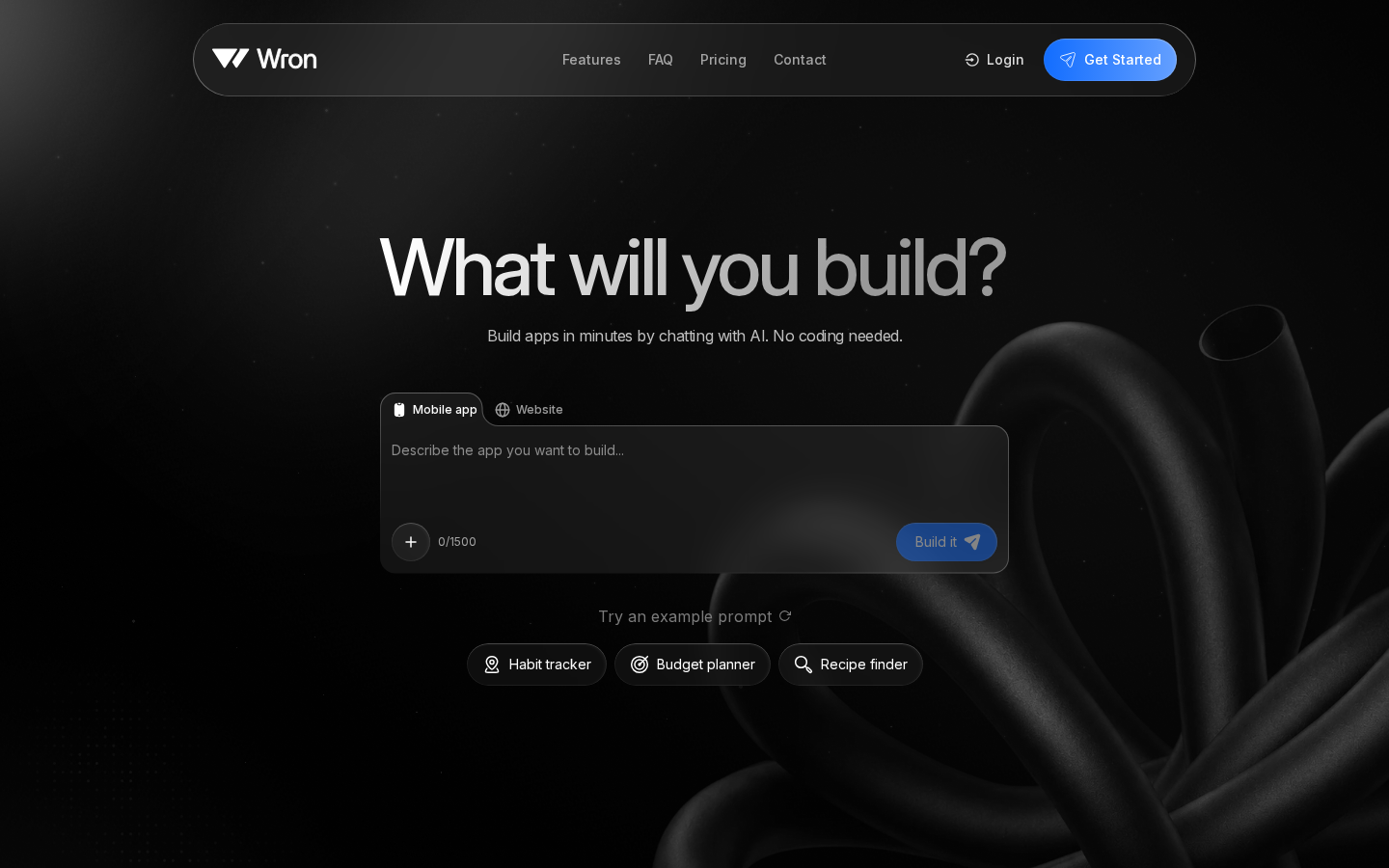
A public redesign of Wron AI's landing page pairs a charcoal floating nav with a matte 3D knot and a Mobile/Website prompt box, aiming for a premium, credible AI app platform feel.

Areesha Fatima
@areeshhaaArchived 2026.09.25Originally posted 2026.09.24
Areesha Fatima @areeshhaaOriginally posted 2026.09.24
@adenwron called http://wron.ai’s landing page ugly. I saw a much bigger opportunity in how the product could be perceived. The goal was to make Wron AI feel premium and credible, while positioning it as the category-defining AI app platform it’s building toward. So, here's my public redesign:
x.com/areeshhaa/status/2103134139738403323Archived 2026.09.25 11:22