Apptonic: a short-video collage landing page for app growth intel
Apptonic's white page centers black text and emoji icons while translucent vertical creator cards float around it, and scrolling demonstrates the product's growth intel instead of explaining it.

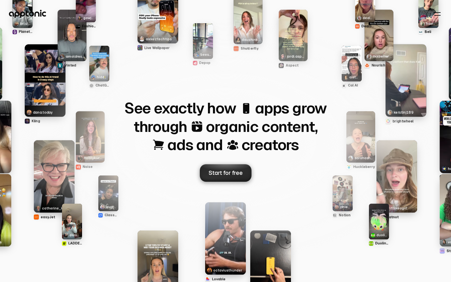
I looked at a lot of apps + landing pages this week. Only one made me want to rethink my own. #1: http://Apptonic.ai The design is obviously really good right from the start, but that’s not what actually stood out to me. As you ‘scroll’, the website visually shows you exactly what the product does instead of explaining it. It does it so well that you have to check it out for yourself. I barely had to read anything before i completely understood what the app does and where the value is. Biggest takeaway I’m stealing for Scamable: Dont just explain the customer experience. Show it. Probably my favourite landing page ive seen in a while. Thanks @stepastepastep for submitting http://apptonic.ai If you want your app possibly featured next week, be sure to submit them for review on any of my posts💪🏽👇🏼