GPT Image 2.5 照片转日式漫画海报提示词
一条可直接复用的提示词:把任意照片做成 3:4 上下分屏海报,上半原图、下半日式手绘漫画印刷风。

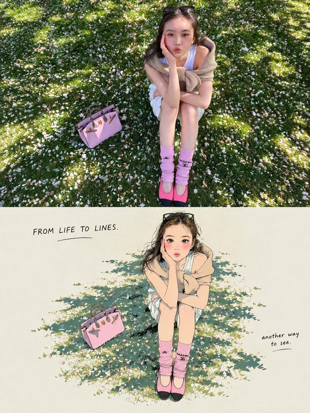
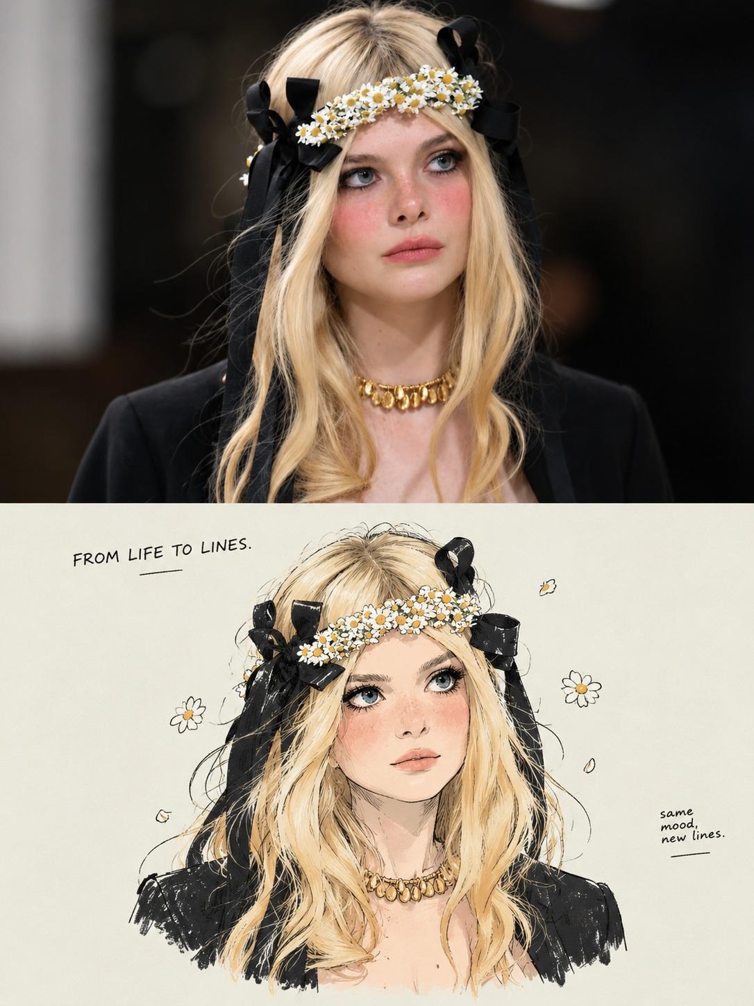
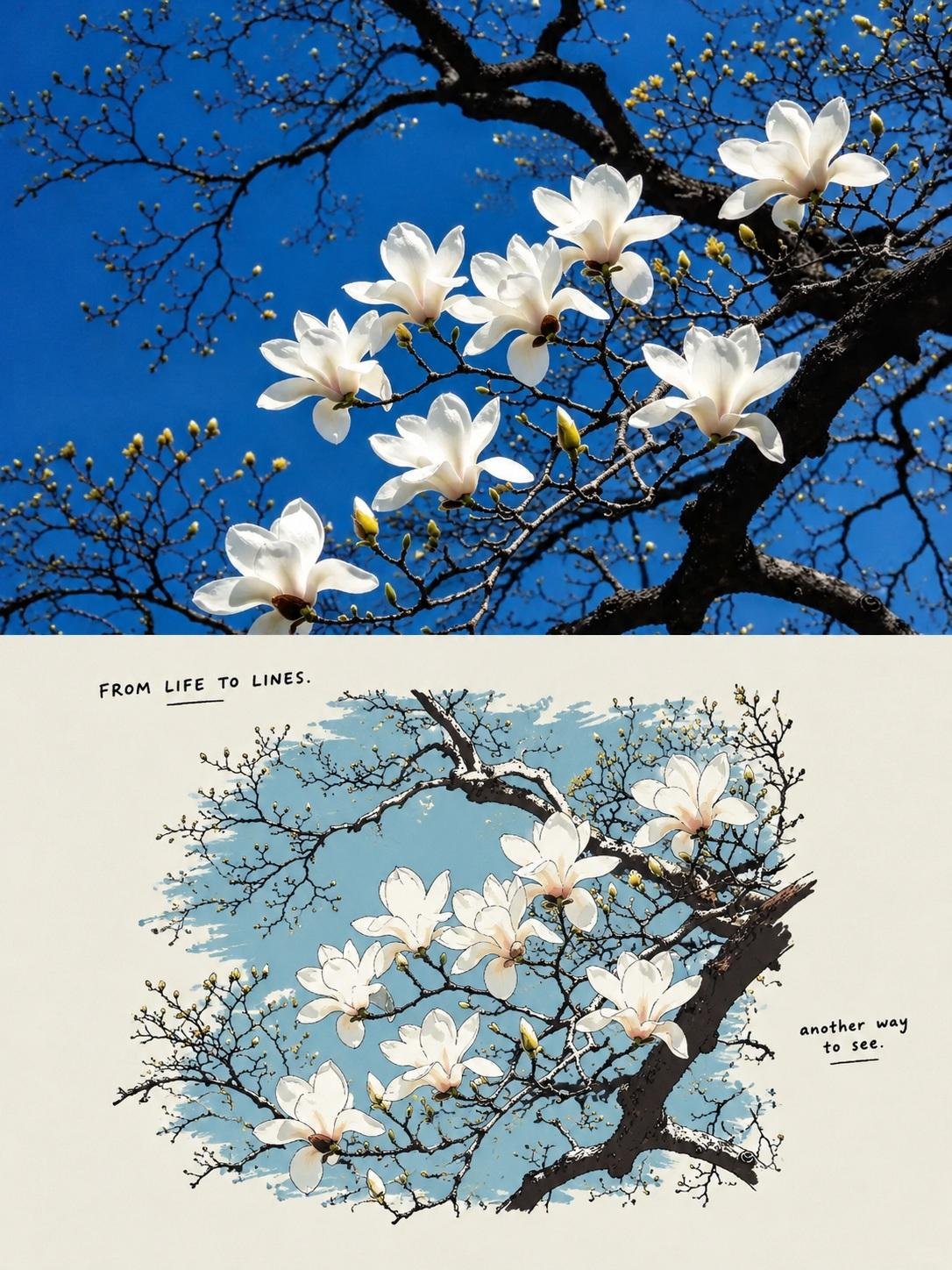
Turn any photo into a minimalist Japanese manga print poster with GPT Image 2.5. Prompt: Task: Create a 3:4 Split-Panel Photo-to-Japanese Illustration Poster Transform the uploaded photograph into a vertically composed 3:4 comparison poster. The upper half displays the original photograph, while the lower half features a Japanese hand-drawn manga illustration with a limited-color print-poster aesthetic, faithfully redrawn from the same photograph. Divide the canvas into two equal horizontal sections, each occupying exactly 50% of the total height. Both sections must have the same width. The horizontal division should connect seamlessly, with no gap, border, overlap, or decorative separator. 1. Upper Half — Original Photograph - Preserve the original photograph exactly as it is. - Do not redraw, recolor, retouch, or add any text to the photograph. - Scale proportionally without stretching or distorting the image. - If necessary, crop peripheral background areas first while preserving the main subject and important visual details. - If the aspect ratio cannot be accommodated without compromising essential content, extend the edges with a light grayish-cream background. Never invent or reconstruct missing parts of the original photograph. 2. Lower Half — Japanese Hand-Drawn Illustration Redraw the photograph as a Japanese-inspired hand-drawn manga illustration with a minimalist, limited-color screen-print poster aesthetic. The original photograph is the exclusive source of the subject's identity, appearance, pose, structure, composition, layout, and relationships between objects. For people: - Preserve recognizable facial shape, hairstyle silhouette, expression, pose, gestures, and clothing category. - Simplify the face into clean manga-style shapes. - Render hair as grouped, flowing masses rather than individual strands. - Express clothing through elegant, simplified fashion silhouettes. For animals: - Preserve the species, body proportions, distinctive coat-color patterns, and pose. - Use simplified contours and flat color blocks to retain recognizability. For objects: - Preserve the original silhouette, essential structural details, and proportions. For landscapes and scenery: - Preserve the terrain, architecture, distribution of visible elements, and spatial depth. - Redraw the main landscape as a cohesive illustration rather than reducing it to an isolated object. Preserve all visible contact, overlap, and occlusion relationships. Depict only what is visible in the source photograph. Do not introduce new subjects, props, gestures, or structures outside the original image. If an additional style reference is provided, use it only for drawing technique, color palette, and layout. Never copy its subjects or content. 3. Linework and Color Treatment Use a consistent combination of delicate ink outlines, naturally simplified shapes, and limited-color flat fills. - Ink outline: Near-black "#02030B", with varied pressure, subtle line-weight changes, occasional pauses, and slightly irregular hand-drawn edges. - Keep internal lines minimal, retaining only the structural details necessary to define form. - Use clean, continuous, opaque color blocks. - Merge shadows into a small number of hard-edged color shapes. - Avoid individual hair strands, dense hatching, photorealistic textures, and excessive decorative detail. - Preserve the subject's essential natural colors and distinctive identifying color patterns. Lower-panel background: Light grayish cream "#ECEDE5". Primary accent: Warm red "#E9444B". Secondary accent: Muted blue-gray "#5296BD". Use red as the dominant accent and blue sparingly. Ensure that accent colors complement the subject without compromising its recognizability. Simplify the background to the cream paper tone, retaining only the environmental details needed to communicate the setting, explain the action, and preserve spatial relationships. For landscape photographs, translate the principal scenery into the illustration rather than omitting it. 4. Lower Panel — Minimalist Poster Layout Create a refined editorial composition with a small illustration surrounded by generous negative space. - Treat the subject and essential environmental elements as one cohesive illustration. - Scale the complete illustration proportionally and center it within the lower panel. - Keep the entire illustration group within approximately 65–70% of the panel width and 60–65% of the panel height. - Fit the illustration within these limits without stretching or distorting it. - Maintain generous light grayish-cream margins on all sides. - Do not let the illustration touch the edges or fill the entire panel. - Do not use large background color blocks to fill the empty space. - Do not add a border around the illustration. The overall layout should resemble a thoughtfully designed Japanese art-print poster: restrained, balanced, airy, and visually sophisticated. 5. Handwritten Typography Add two small handwritten text elements within the negative space of the lower panel. Top area: Place a small, delicate, near-black handwritten phrase, such as: “FROM LIFE TO LINES.” Beside the illustration: Add an even smaller, casual handwritten phrase, such as: “another way to see.” Generate both phrases automatically based on the subject, setting, and emotional atmosphere of the original photograph. The wording should feel concise, natural, poetic, and contextually relevant. The example phrases are references for tone and placement only. Do not use them automatically if a more fitting caption can be generated. Typography must remain subtle and secondary to the illustration. Use a natural handwritten style with fine, slightly imperfect strokes. Ensure all generated text is spelled correctly and legible. 6. Final Output Requirements - Aspect ratio: 3:4 portrait. - Upper half: 50% of canvas height, displaying the untouched original photograph. - Lower half: 50% of canvas height, displaying the Japanese-inspired hand-drawn illustration. - Equal panel widths, seamless horizontal transition, no gap, no frame, and no overlap. - Consistent minimalist Japanese manga linework and limited-color print-poster styling. - Small, centered illustration with generous cream-colored negative space. - Subtle, context-aware handwritten typography in the lower panel. Core principle: The original photograph determines what is depicted. The illustration style determines how the lower half is redrawn. Preserve the source's identity and composition while transforming the lower panel into an elegant, minimalist Japanese illustration poster.