Quicker:米白底上的全平台 Mac 收件箱
One inbox for all your DMs;浅底大字与多平台胶囊图标,下方高保真多栏收件箱 mock,AI 草稿回复的 Mac 社交收件箱。

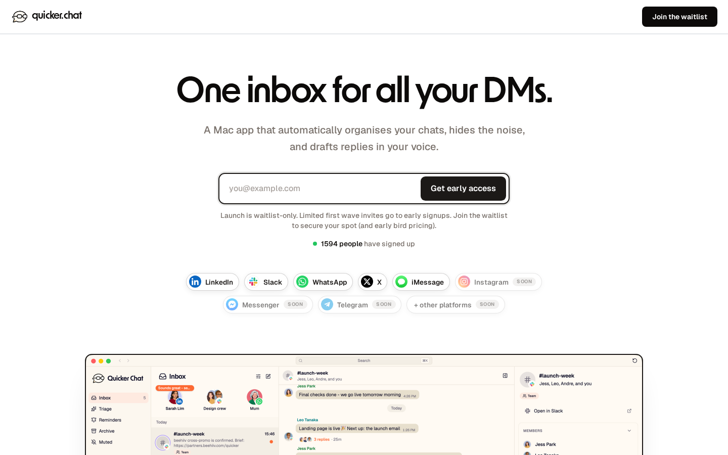
founders and marketers: you need a MEMORABLE landing page for your product launch ours just got 1,200+ signups in <24h here’s why it works (8 things you can steal): (P.S. I explain why "memorable" beats "pretty" at the bottom) 1. say what it is in 6 words our headline for http://quicker.chat is "One inbox for all your DMs." then 1 line with 3 specific outcomes: organises your chats, hides the noise, drafts replies in your voice. i see way too many landing pages with vague hero copy - viewers need to understand exactly why they'd sign up WITHOUT needing to scroll. 2. show the real product, not a mockup the hero is a real screenshot of the app (click it and it flips between light and dark mode - tiny bits of fun go a long way). be honest about what's live - the real app, and which integrations are supported vs 'coming soon'. people want authenticity. 3. make the scarcity real, and explain it ours: 'waitlist only + invites go out in waves + earliest signups first + early bird pricing that increases over time'. gives people a reason to sign up NOW (i.e. justify why signing up earler = better) 4. put a live counter on the page "[N] people have signed up" with a little pulsing dot. social proof that updates itself. gives people another reason to sign up (others have, and more will). you can say 'waitlist opened [X] days ago' to contextualise a low number of early signups. 5. write a letter, not a feature grid the middle of the page is "A note from Tom" - a pic, my signature, styled like a sheet of paper. it's a genuine, gentle thought from a real human. my aim is not to convince, or tell pople they're wrong - its to speak to people who have the same problems as me in such a way that they naturally nod their head in agreement. 6. people remember specific feelings generic copy: "too many types of conversations on each platform". ours: "Mum's on WhatsApp, sitting between a potential hire and the 'Accountability Group Chat'." its specific and real, so it doesn't read like you're being marketed to. 7. answer the objections that closes the tab our FAQ literally answers all the hardest questions, like: "I don't get hundreds of DMs. Is it still for me?". write down the exact thought that stops a signup, then answer it honestly. 8. remove every bit of friction the email box is already selected when the page loads - you just start typing. the page after signup says: "Check your inbox" + has 1-click "Open Gmail" / "Open Outlook" buttons. small technical tweaks to make the journey as smooth as possible. why this matters: → you're already doing the hard work getting people TO the page. you need the page to turn visits into signups and signups into customers. → memorable pages get shared. nobody forwards slop at this point. → AI is making every landing page FEEL the same. the human ones are what stand out now. drop your landing page in the comments and I'll tell you the 1 thing I'd change i hope this helps someone!